Creating Effective Landing Pages for Mobile
March 17, 2026
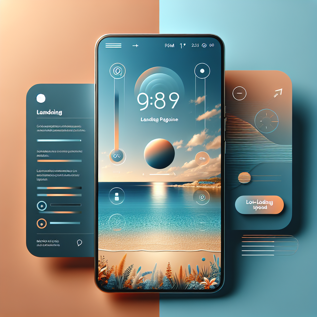
Understanding Mobile-First Design Principles
The digital landscape has fundamentally shifted, with mobile devices now accounting for over 60% of web traffic globally. For businesses in Malaga and throughout Spain, this means that mobile landing pages Malaga strategies are no longer optional—they’re essential. Mobile-first optimization begins with understanding that your smallest screen is your primary canvas, not an afterthought.
When designing mobile landing pages, start by stripping away everything non-essential. Mobile screens offer limited real estate, so every pixel must serve a purpose. Focus on your core message and primary call-to-action first. This approach naturally creates cleaner, more focused pages that convert better even on desktop devices. The mobile-first mindset forces you to prioritize what truly matters to your customers.
Responsive design forms the technical foundation of effective mobile landing pages. Your page should automatically adapt to different screen sizes, orientations, and device capabilities. This means using flexible grids, scalable images, and CSS media queries that ensure your content looks perfect whether viewed on a smartphone in portrait mode or a tablet in landscape orientation.
Creating Touch-Friendly Interfaces That Convert
Touch interactions differ fundamentally from mouse clicks, and your mobile conversion Spain strategy must account for this reality. Buttons and clickable elements should be at least 44×44 pixels—the minimum size recommended for comfortable finger tapping. Space these elements adequately to prevent accidental clicks, which frustrate users and kill conversions.
Consider the natural thumb zones on mobile devices. Most users hold their phones with one hand, making certain screen areas easier to reach than others. Place your most important conversion elements—like “Buy Now” or “Contact Us” buttons—in the lower-middle portion of the screen where thumbs naturally rest. This small adjustment can significantly boost your mobile conversion rates.
Form fields deserve special attention on mobile landing pages Malaga businesses create. Minimize the number of required fields, use appropriate input types that trigger the correct keyboard (email, phone, number), and implement auto-fill capabilities. Every additional field or keystroke represents friction that reduces conversion rates. If you need extensive information, consider multi-step forms that feel less overwhelming on small screens.
Implementing Fast Loading Techniques
Speed isn’t just a nice-to-have feature for mobile landing pages—it’s a conversion critical factor. Research shows that 53% of mobile users abandon pages that take longer than three seconds to load. In competitive markets like Malaga, where businesses vie for tourist and local attention alike, those lost seconds translate directly to lost revenue.
Image optimization represents the single biggest opportunity for speed improvements. Compress images without sacrificing quality using modern formats like WebP, which can reduce file sizes by 25-35% compared to traditional JPEGs. Implement lazy loading so images below the fold only load when users scroll to them. This technique dramatically improves initial page load times.
Minimize HTTP requests by combining files where possible and using CSS instead of images for simple graphics and effects. Every external resource—fonts, scripts, stylesheets—adds loading time. Audit your mobile landing pages ruthlessly and eliminate anything that doesn’t directly contribute to conversions. Consider using a Content Delivery Network (CDN) to serve your assets from servers geographically closer to your Malaga customers.
Enable browser caching and GZIP compression on your server. These technical optimizations might sound complex, but most modern hosting platforms offer simple toggles to activate them. The performance gains are substantial—often reducing page sizes by 70% or more and dramatically improving load times for returning visitors.
Mobile-Specific Conversion Tactics for Malaga Businesses
Mobile users behave differently than desktop users, and your conversion tactics should reflect this reality. Mobile sessions tend to be shorter and more intent-driven. Users often research on mobile and convert on desktop, or vice versa. Your mobile-first optimization strategy should account for these cross-device journeys while still optimizing for direct mobile conversions.
Click-to-call functionality is perhaps the most powerful mobile-specific conversion tool. For service-based businesses in Malaga—restaurants, hotels, tour operators, professional services—enabling users to call directly from your landing page removes enormous friction. Make your phone number prominently displayed and tappable. Many mobile users prefer speaking to someone rather than filling out forms.
Location-based features take on special importance for Malaga businesses targeting both locals and tourists. Integrate maps that show your physical location, provide directions, and display proximity to landmarks. Use geolocation to personalize content when appropriate—showing different messaging to users in Malaga versus those searching from abroad planning their visit.
Social proof works exceptionally well on mobile landing pages. Include customer testimonials, ratings, and reviews, but keep them concise and scannable. Mobile users won’t read lengthy testimonials, but they will notice star ratings and short, punchy quotes. Video testimonials can be particularly effective if they’re short (under 30 seconds) and load quickly.
Progressive disclosure is a mobile conversion Spain technique that reveals information gradually as users need it. Instead of overwhelming visitors with everything at once, start with your core value proposition and primary call-to-action. Provide expandable sections for users who want more details. This approach keeps pages clean while still serving information-hungry prospects.
Testing and Optimizing for Continuous Improvement
Creating effective mobile landing pages isn’t a one-time project—it’s an ongoing process of testing and refinement. Use mobile-specific analytics to understand how users interact with your pages. Heat maps show where users tap, scroll maps reveal how far down they read, and session recordings let you watch real user journeys.
A/B testing on mobile requires larger sample sizes than desktop because mobile traffic often converts at different rates. Test one element at a time—button colors, headline copy, form lengths, image choices—and give each test sufficient time to reach statistical significance. What works on desktop doesn’t always work on mobile, so never assume your desktop winners will translate directly.
The mobile landscape continues evolving with new devices, screen sizes, and capabilities emerging constantly. Your responsive design should be future-proof, adapting gracefully to devices that don’t exist yet. Regular audits of your mobile landing pages ensure they remain optimized as technologies and user expectations change.
For Malaga businesses competing in an increasingly mobile world, mastering mobile landing pages isn’t optional—it’s essential for survival and growth. By implementing mobile-first optimization, creating touch-friendly interfaces, ensuring lightning-fast loading, and deploying mobile-specific conversion tactics, you’ll capture the attention and business of the mobile-dominant market. The time to optimize your mobile presence is now. Ready to transform your mobile landing pages into conversion machines? Let’s discuss how we can elevate your mobile strategy and drive real results for your business. Contact us today for a comprehensive mobile optimization consultation.